
Introduction
As we’ve explored in previous posts, data visualizations are one of the most compelling and effective ways to understand the world around us. This is because data visualizations tell stories: creatively presenting a dataset to an audience to inform them about a given issue or phenomenon.
While visualizations have become increasingly complex, informative, and sophisticated, they sometimes go a little too far…providing too much information or becoming too creative for their own good.
This renders visualizations confusing rather than helpful to their intended audience, and overly complicated rather than easy to understand—defeating the very purpose of visualization to begin with!
There are several ways this problem can occur:
- poor color choices,
- disproportionate sizing of visual components,
- the presence of extraneous or redundant data,
- or arranging the data in a way that simply doesn’t make any sense.
In this article, we’ll take a look at examples of bad data visualizations. We’ll break down where the graphic went wrong—but we’ll also explain how to improve it, so it can better present the story it’s trying to tell.
1. Unclear data direction
The problem 🤔
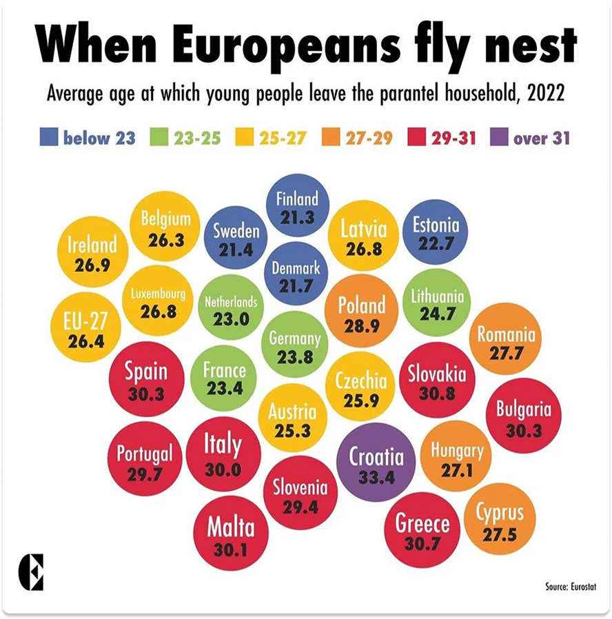
In this graphic, we see the average ages at which European young people leave home: Nordic countries the youngest, Western and Central Europe in the mid-20s, and Eastern Europe and the Mediterranean countries in the late 20s (or even later!). Bubbles represent countries, each including the national average age of “flying the nest.” Bubble coloration is dependent on this average age.
Overall, this isn’t a bad concept. But here’s the problem: the bubbles are not arranged in any meaningful sense. The red countries seem to cluster somewhat at the bottom, and blue countries at the top—but that’s it. This might be a bad take on a map of Europe, but we can't be sure. Bizarrely, the bubble indicating the average EU age of leaving home is barely identifiable, located on the far left of the graphic and indistinguishable in size and format from any of the country bubbles. In short, the missing key here is organization.
The solution 💡
A more effective means to organize this data would be to construct it in color-coded layers, with the bulk of yellow countries falling in the middle, and tapering off toward the blue and red categories above and below.
The EU bubble could either be placed off to the side, or in the center of the yellow layer. Regardless of its placement, it should have some distinguishing feature—such as larger size or bolded text—to indicate its importance.
These fixes would allow readers to not only know the differences between “flying the nest” ages by country, but also understand how these data points fit together, allowing them to draw correlations and conclusions about this social phenomenon.
2. Too many variables
The problem 🤔
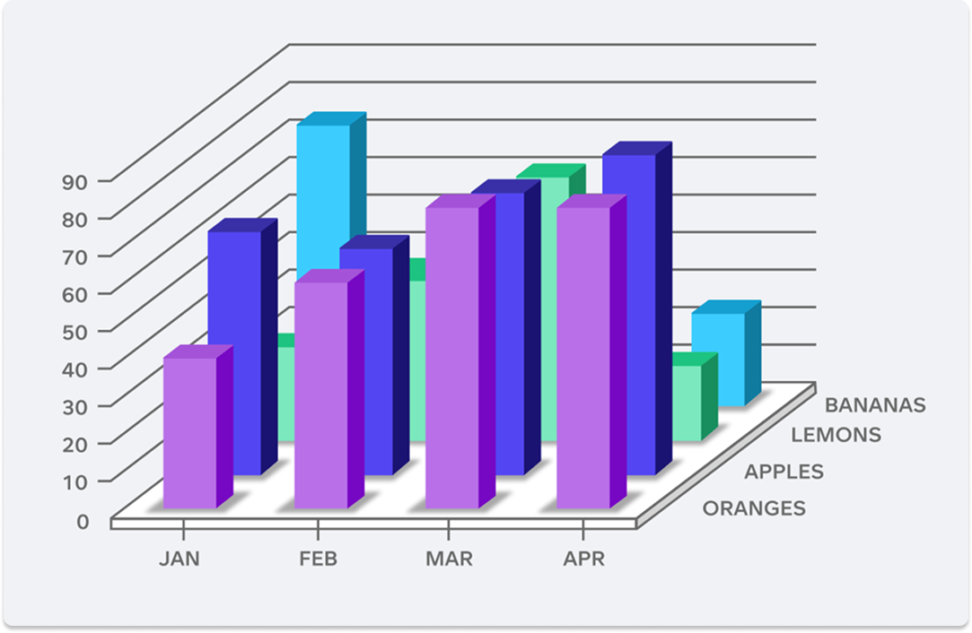
This chart is just a classic case of TMI (too much information)! The data here are measured on not just a typical two, but three axes: number, month, and type of fruit. While we can appreciate the multidimensionality of this chart and its effort to communicate as much data as possible in one visualization, it’s just too much to understand at first glance.
And this leads to some serious problems when it comes to interpreting this graphic. It’s difficult to ascertain the number of lemons across all months, for example, and impossible to see the number of bananas in February and March.
For another, the reader can’t accurately tell the number of fruits for any of the bars in the central portion of the graph. If they’re not placed directly against the number grid, the amount of fruit is basically impossible to determine.
The solution 💡
The solution to this graph’s problem is to eliminate one of the axes and have the new graph measure only two components instead of three. While this will result in more graphs to convey the same amount of information, they will be far easier to read.
For example, one could track the number of oranges sold across the four months, and make corresponding graphs for apples, lemons, and bananas. Alternatively, one could track the four types of fruit sold in January, and make corresponding graphs for the remaining three months.
3. Counterintuitive pie chart percentages
The problem 🤔
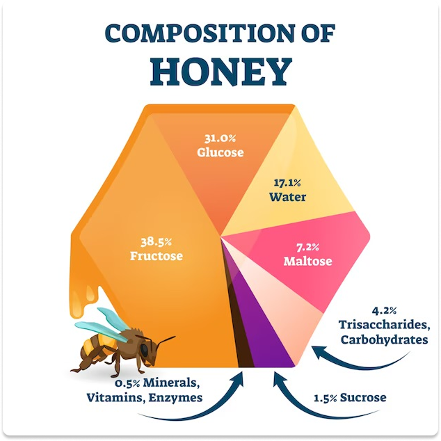
The concept for this bespoke pie chart is creative and decidedly unique. But man, we’ve gotta say it—the math isn’t mathing! While every side of a hexagon is equal to one-sixth, or 16.67 percent of the hexagon’s total area, what’s seen here completely upends this basic reality.
Somehow, the fructose section (38.5 percent) takes up vastly more space than the glucose section (31.0 percent), which in turn is only slightly larger than the water section (17.1 percent). And the 0.5 percent sliver of minerals, vitamins, and enzymes is far too large for its stated percentage.
The solution 💡
It’s fine to put a creative spin on a typical, “boring” pie chart—but this shouldn’t come at the expense of statistical accuracy, or just plain common sense. Thankfully the fix for this botched honeycomb chart is a simple one: restructure the graph sections so that they are in proportion to their stated values.
4. Disproportionate pictogram sizing
The problem 🤔
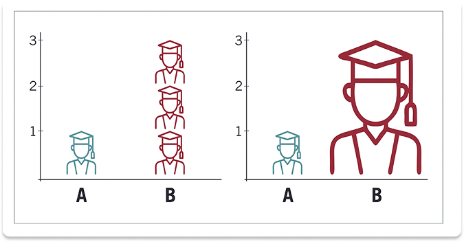
This is another case of incorrect proportions, but of a different type. In this case, two bar charts indicate the number of graduates in A and B cohorts: one graduate in A, and three in B.
But instead of using bars, the charts use pictograms. The left-hand graph uses discrete units to count the number of graduates; meanwhile, the right-hand graph uses a single large pictogram to indicate the same quantity.
However, this is where the problem for the right-hand chart arises. Rather than simply indicating quantity, using a scalable pictogram introduces another element of dimensionality—not just of number, but of size.
This leads to a situation where, in order to keep the pictogram proportional while hitting the “3” mark, it is scaled to a size that leads the audience to believe the difference between A and B is much greater than it really is. Indeed, the B graduate doesn’t appear merely three times larger than the A graduate, but rather six or seven times larger!
The solution 💡
The solution to this poor-quality graphic (on the right) is found on the much better graphic on the left. Here, three pictograms of equal size are stacked on each other, proportionally (and correctly) indicating the difference between 1 and 3.
When thinking of how to display data, one has to remember what exactly is being represented: difference in proportion (the relationship between parts of a whole), or difference in numerical quantity (comparing values or quantities across categories or time).
If you want to see a proportional representation, use visualizations such as pie (donut) charts, stacked bar charts, or tree maps. But if you’re looking to simply compare dataset sizes, use discrete units—or a simple bar—to represent them realistically.
5. Distorted pie chart view
The problem 🤔
As an example of proportionate rather than numerical representation, the two pie (donut) charts below display proportionate shares of “cause of death.” Looking at the chart on the right, we’re led to believe that section B is the largest section—or at least of equal size to section A. But looking at the chart to the left, we see this isn’t the case, and section A is quite clearly the largest. What gives?
The 3D pie chart view on the right distorts the graph, with section B tilted toward the viewer and thereby making this section appear far larger than it really is. In short, it’s a trick of the eye—one that, while not presenting false information outright, creates a misleading perception of reality.
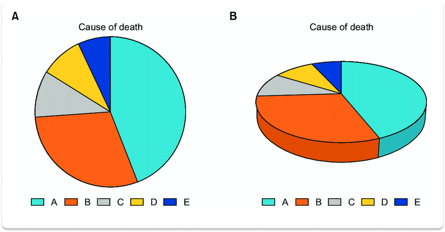
The solution 💡
The solution here is really simple: avoid using 3D pie charts, which invariably distort the data you’re presenting, and use 2D charts instead. Doing so is more honest, and also ensures you’re getting the most reliable and accurate data possible. This is especially important because so much of what counts as “good” data visualization relies on first glance impressions to establish not only readability, but truthfulness.
6. Where to begin…?
The problem 🤔
For the grand finale, a visualization with not just one or two, but several issues! This graphic shows how members of the “Baby Boomer” generational cohort describe themselves, with each descriptor indicated by a different color-coded percentage on a humanoid figure. This graphic is ultimately a “creative” pie chart, much like the previous honeycomb example in this list (number 3).
However, while the honeycomb graphic simply didn’t represent proportions correctly, this graphic commits multiple statistical and design sins:
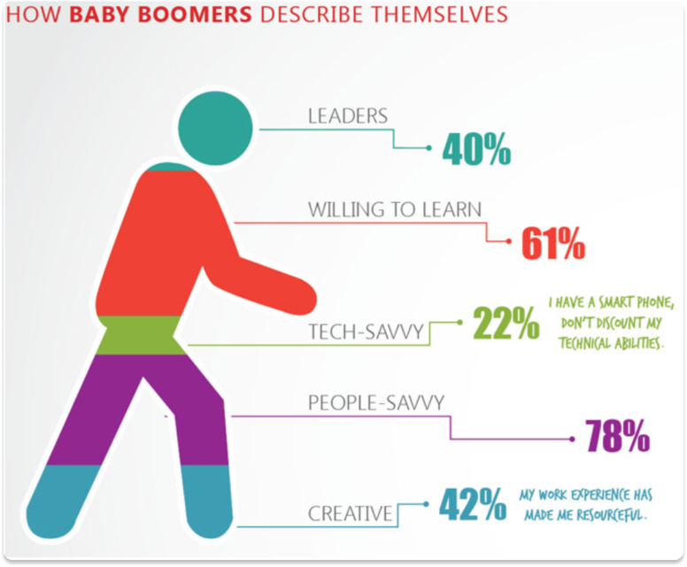
- The percentages listed don’t add up to 100, but rather 243. Here, where no overlap between categories is present, the viewer is led to believe the graphic designer has made a severe statistical error.
- The spaces allotted to each category don’t correspond at all with their given percentages. Quite clearly, the “people-savvy” category (78 percent) does not take up 78 percent of the humanoid!
- It’s also uncertain why the designer chose to use a humanoid and a seemingly random color scheme. What information do these design choices impart to the reader, or what information are they trying to reinforce in the reader’s mind? We simply don’t know.
Overall, this graphic gives a strongly misleading impression about the information it’s trying to convey. When the reader sees the humanoid, he/she mentally associates this with a totality (such as 100 percent) in the same way as the circle in a pie chart.
But when the reader sees category percentages that exceed 100 and have no visual basis within the graphic, he/she concludes the numbers are randomly placed and have no real “story” behind them. In other words, the graphic becomes meaningless.
Build your first dashboard.
Start your 14-day free trial today
The solution 💡
The only solution to fixing this graphic is to scratch it entirely and start afresh—this time, as a bar chart. Transferring this graphic’s data to a bar chart format will allow the intended audience to better understand the relationship between these value categories (“people-savvy,” “creative,” etc.) without giving the audience a false idea that these values are supposed to numerically “fit” together.
If numerical data rather than just percentages can be obtained, an even better solution would be to create a Venn diagram. The bubbles’ overlap would allow the viewer to know more about the relationships between respondents’ values: for example, how many respondents said they were both “leaders” and “willing to learn”? And to give the viewer a quick idea of how many respondents fall in each value category, the bubbles can be sized accordingly.
Conclusion
Because data visualizations are basically ubiquitous at this point, it’s no surprise that there will be both good and bad examples in abundance. This is why it’s important to know the warning signs of a bad data visualization, so that you can ensure the data you interact with is presented in a reliable, valid, and trustworthy way.
With Plecto, you can avoid the pitfalls of poor data visualization and rely on tried-and-true visualization methods, ensuring your organization can access its data transparently and accurately. This clarity will give you the insight you need to make data-based decisions and hit your KPI goals.
Don’t waste your time on substandard data visualizations! Sign up here for a free two-week Plecto trial today.
JAMES NIILER
Content Writer


