Table of contents:
Discover Data Visualization and Why It Matters
What Is Data Visualization?
Data visualization is everywhere in today’s world. Most of the information we engage with on a daily basis now comes in the form of graphics rather than raw text or spreadsheet tables. Indeed, data visualization is so ubiquitous we might not always realize when we encounter it! But what exactly is data visualization, and why is it so important?
Data visualization is the representation of data through graphics, with the intention of communicating information and insights. A good data visualization allows the viewer to understand relationships between, and draw conclusions about, the data points and trends it displays.
The most important statistic to remember about data visualization is that 90% of information conveyed to the human brain is visual. At a fundamental level, we see the world. Being able to visualize data, therefore, is one of the most powerful and effective ways to express and communicate information.
Since the 1800s, data visualization has been used in scientific research, business endeavors, and mass media—such as newspapers and now the internet—to help explain the complexity of the world around us. Improved means of obtaining and storing data—first with hand-recorded observations, then with large computers, and now with smartphones—has meant an ongoing democratization of data as well. Today, it’s never been easier to create, obtain, visualize, and distribute data.
So what does this mean in a practical sense? With seemingly everything having potential to be quantified and turned into data, it can be downright dizzying to determine how to engage with visualization. Paradoxically, figuring out how to visualize data, supposed to make data comprehension easier, can actually be a huge challenge in its own right!
That’s where this article comes in. Here, we’ll take a look at the different types of data visualizations, their uses and applications, and relevance in a business context. Ready to learn about data viz? Let’s get started.
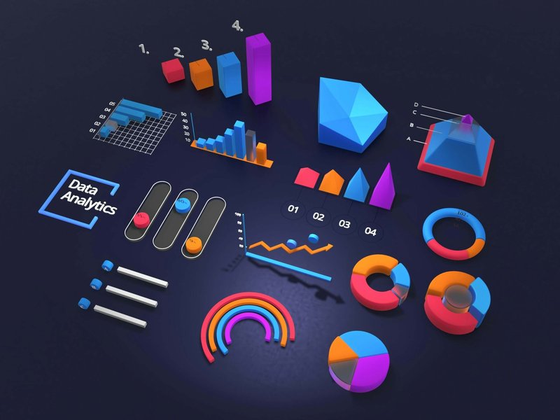
Types of Data Visualization
Over the decades, numerous methods of visualizing data have been devised to communicate specific types of information. You can think of each type of visualization as communicating a specific node of data, just like a photo or a novel.
But just as there is a huge difference between the amount of data transmitted by these two media, there are large differences between the amount of data transmitted by visualizations. Some visualizations—like speedometers—are extremely simple, just like a photo snapshot. Others—like heat maps—contain far more depth, transmitting multiple layers and types of data like a book does.
Simple or complex? Immediate, on-the-go insights or long-term trend monitoring? KPI goal-setting or statistical analysis? Knowing what you want to visualize is the first step in showing your team their numbers.
The next step is determining how. Systems like Plecto make it easy to visualize your team’s performance data in a variety of formats such as tables, line charts, speedometers, and leaderboards. We’ll go over these—and more—below.
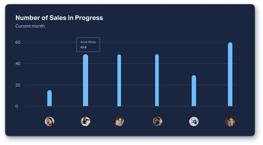
Bar Charts
This type of data visualization uses stacked lines of data to indicate quantity on the vertical Y-axis against category (or person) on the horizontal X-axis. Bar charts are useful for comparing categories; displaying frequencies, outliers and trends; and visualizing changes over time, especially in large datasets. Just as in the example below, you could use a bar chart to show each agent’s number of sales in the pipeline.
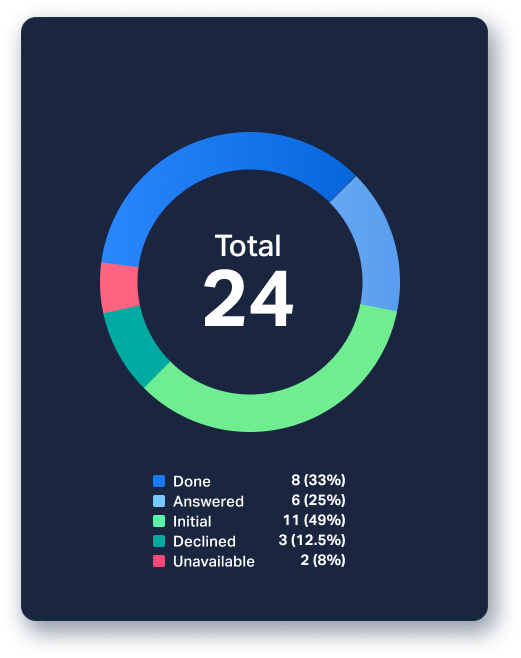
Donut (Pie) Charts
Pie charts (or donut charts as they're referred to in Plecto) are characterized by clearly demarcated parts within a circle, each indicating a percentage of the whole. Donut charts are useful for showing proportions, comparing parts of a whole, and highlighting major components of smaller, simpler datasets. A good way to use donut charts is to visualize the relative sizes of each market your company operates in, as shown in the example below.
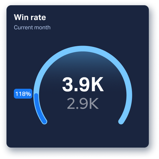
Speedometers
You probably associate speedometers with cars, but in the context of KPIs, this data visualization format is used to observe progress toward a target. In this example, the speedometer shows the achieved win rate against the target win rate.
The same data is also displayed as a percentage, indicated as a colored region on the ring. Because they’re pretty intuitive, speedometers are best used as a motivational tool, as they allow users to check a project's status by seeing how close they are to reaching the target at hand.
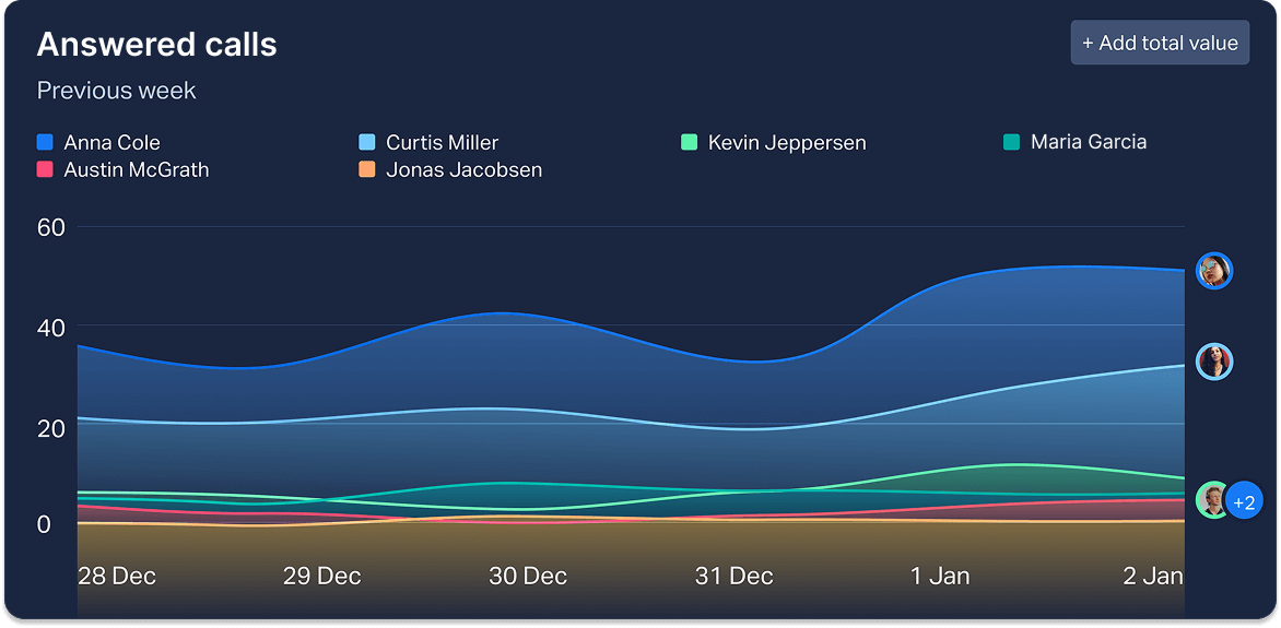
Line Charts
Because they incorporate multiple variables, line charts are a particularly powerful visualization method. As they track continuous change over time, these charts are terrific for identifying trends or comparing multiple data sets (such as to a previous period). You can see how easy it is to identify the trajectory of accumulated new changes over time with a line chart, such as in the example below.
NOTE: While Plecto doesn’t offer the following visualizations (scatter plots, heat maps, histograms and tree maps) on its platform yet, they’re still commonly used in data analysis and therefore worth discussing.
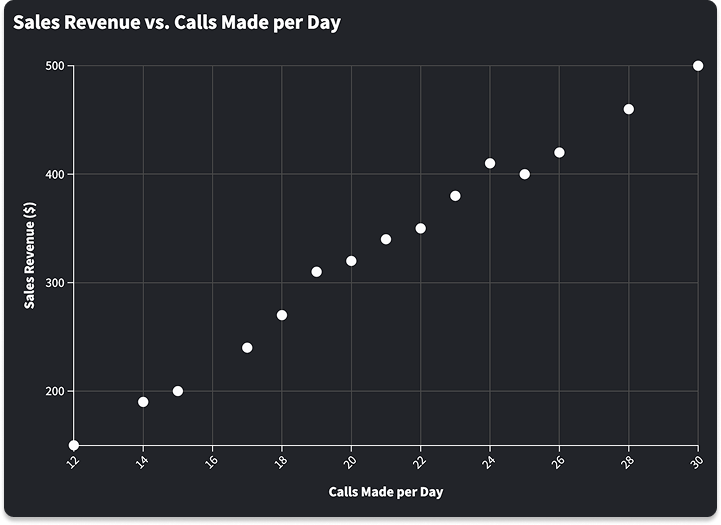
Scatter Plots
This visualization format displays discrete points between two axes (which indicate variables). Scatter plots tend to be used for determining association or correlation, tracking change over time, visualizing distribution and outliers, and comparing multiple datasets. The example to the right shows a positive correlation: sales revenue increases as more money is invested in advertising.
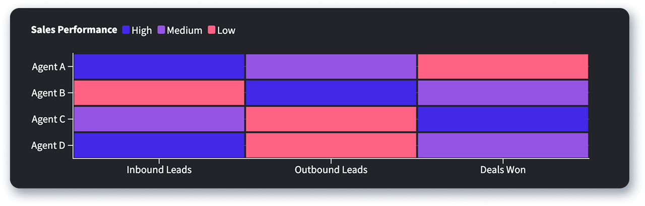
Heat Maps
Heat maps represent the magnitude of values in a matrix as color. Typically, the higher the value, the darker the color, though this practice varies. Heat maps can be particularly useful in a call center context.
For example, the heat map below shows the performance level of four sales agents based on how many inbound leads, outbound leads, and won deals each sales agent has achieved in a period. With this data visualized, agents can see their strong and weak points of performance, and determine how best to address or improve upon these.
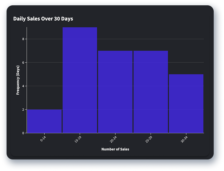
Histograms
Histograms resemble bar charts, but instead plot data on a so-called “normal” distribution curve. They are used to show the frequency of data points in given categories (called bins). You can use a histogram, like the example here, to show distribution of sales over a month in your call center. With this knowledge, you can project your number of sales and amount of sales revenue over a given period.
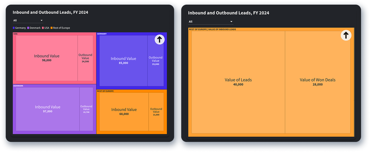
Tree Maps
Tree maps display categorical data in a “nested” image, or as squares within a larger square. Each small square represents a proportion of the whole, allowing for categories to be compared in a top-down fashion.
Tree maps are supposed to be used to evaluate large datasets. In this example, you can see the proportions of inbound versus outbound leads (filtered by market location) and then the value of inbound leads versus the value of deals won from these leads.
4 Ways Data Viz Is Used in the Workplace
Beyond just providing interesting and creative ways to explore datasets, what are the actionable benefits that data visualization can give your business? The good news is that quantifying trends and displaying them creatively can have immensely positive impacts at every level of your organization.
Data visualization has applicability for all teams—sales, marketing, customer service, and finance—as well as the C-suite.
The key aspect of data visualization here is that it can empower: your management to make data-driven decisions; your colleagues to take accountability for their work; and your organization to hit its targets overall!
Here are just a few ways that data visualization can enable this culture of workplace empowerment.
1. Data Accessibility
When you visualize and display data, it’s typically available to all. This allows employees to stay focused on the numbers: always measuring their own performance against a given goal, and being able to immediately observe relevant stats in real time. By having transparent and accessible data readily available to everybody, employees can see how their individual efforts impact larger goals and company results.
2. Employee Empowerment
Self-learning, self-motivation, and teamwork are key skills to develop successful teams. Having performance data publicly accessible allows your employees to monitor their progress and take initiative by determining where they should focus their efforts.
Using data visualization on real-time dashboards allows your employees to see their performance as it happens and take ownership of it: responding to the ups and downs of their current activity, rather than relying on a manager to ensure they’re up to speed.
3. Coaching and Course Correction
You can use data insights to coach employees, allowing everyone to stay on target and improve numbers. This can be done with on-the-fly feedback, or saved for sit-down one-on-ones.
Take this example: it’s Wednesday just before lunch. A manager notices on the team’s activity dashboard that a certain sales rep has made far fewer calls than yesterday.
With this information, the manager might opt to quickly chat with the agent about why fewer calls have been made. This way, any relevant course corrections be made in a timely manner, before any challenges develop and performance turns sour.
On the other hand, prolonged underperformance, challenges, or trends can be addressed during one-on-one sessions, where relevant action plans can be drawn up. In any case, data visualization is an invaluable resource for personalized and successful coaching.
4. Improving Business Strategy
Finally, data visualization gives sales managers the ability to immediately understand high-level sales KPIs that impact your company’s growth and direction. In this case, you’re likely interested in overarching, team-based sales KPIs like actual sales revenue, pipeline revenue, percentage of deals won, and average revenue per account (ARPA).
Because these KPIs create the “big picture” of your team’s performance, they help guide strategic decisions and enable your team to hit planned goals.
The Bottom Line
As the world grows increasingly data-driven, visualizing and interpreting effectively is more important than ever. In its huge variety of formats, data visualization provides a wealth of invaluable insights for business managers and employees alike.
Whether you need to uncover long- or short-term trends, track employee performance, or build a better culture of decision-making, visualizing data is the magic key to turn raw numbers into actionable insights.
Harnessing the power of visualization organizations can empower themselves to create a transparent, data-driven, and action-focused workplace culture. Knowing the trends that shape data visualization are more active than ever, why not get ahead of the game and make use of data visualization tools yourself?
Sign up below for a free Plecto demo—and see the transformative results of data visualization firsthand!
Start your 14-day
free Plecto trial today.

JAMES NIILER
Content Specialist
An in-house content writer and specialist at Plecto, James brings an academic touch and journalistic flair to his marketing copy. Having worked and studied on both sides of the Atlantic, James is a great believer in the importance of communicating across cultures and industries. Catch his work here on the Plecto blog, or as a guest contributor on other B2B websites.